Roomba User Experience
As the UX lead for Roomba from 2015-2019, I was responsible for designing key experience touch points along the path from unboxing and setup through use, optimization, troubleshooting, and maintenance.
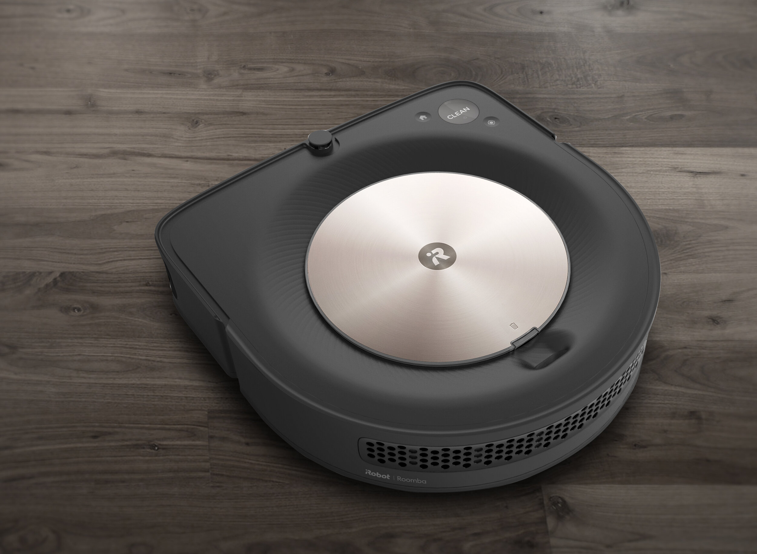
I am especially proud of the work our team did on the Roomba s9+ and i7+, which earned a Red Dot “Best of the Best” award, and which Wirecutter called “the best robot vacuum that money can buy”.
Family portrait of the Roomba i7 (left) and s9 (right)
Background
When I joined iRobot, the team had just launched the Roomba 980—the company’s first connected product—and was just beginning work on a new flagship robot vacuu, that would eventually become the Roomba s9. Along the way, we would also launch the Roomba i7+ with a dock that it can automatically empty its bin into, and several entry-tier robot vacuum cleaners including the Roomba 690 and 890.
This was a great time to join the Roomba team, as consumers were getting past many of the basic hangups that had historically limited robot vacuum adoption (no, it won’t fall down the stairs) and were starting to ask more sophisticated questions about the ownership experience. So I knew that getting the details right would be key to differentiating Roomba and cementing iRobot’s position as the industry leader.
Getting Organized
Coming into a program that was already in motion, my first action was to lead the team through a heuristic evaluation of the s9 prototype. I chose a framework that involved enumerating all of the micro-interactions that a user would have with the hardware, and setting experience targets based on impact, frequency, and competitive benchmarking. We worked together to give a gut-feel rating to each interaction, drawing from previous research when available.
Early scorecard for the Roomba s9
This heuristic “scorecard” proved to be a great tool for tracking progress as the design matured. At every subsequent prototype build, we would return to the scorecard to see what areas still needed more focus. This had a big impact on many details of the ownership experience that could have otherwise been overlooked, like getting tangled hair out of the rollers.
Finding opportunities for delight in the setup process
I also began mapping out the user journey, focusing most closely on the unboxing and setup process to ensure a great day one experience. This proved especially helpful in designing the packaging materials, ensuring that we present the product well and that there is a smooth handoff between the packaging materials, the product, and the app.
Robot Interface
Existing robot vacuums tended to have complicated and often confusing hardware interfaces. These UIs typically included buttons for switching modes or setting a schedule, backlit status indicator icons, and even the occasional LCD display.
Examples of RVC interfaces
It quickly become clear that we would need a new approach. Roomba lives on the floor, often in an out-of-the-way room, so tiny icons and buttons that require bending over would deliver a fundamentally poor experience.
A better solution would be something more expressive, that could be seen and quickly understood from across the room, and that would frame our robots not as complicated appliances but rather intelligent devices, driven by software, that are meant to be controlled primarily via a smartphone or voice. Ideally the solution would be something that could scale across the product portfolio and maybe even make our robots feel more alive.
Early light ring prototype
With the s9’s design centered around a large circular “nucleus” (which doubles as the lid for the dustbin), an expressive light ring was a natural solution. But for a program that was already behind schedule and over its cost target, there was much work to do to prove out this concept.
I worked quickly to develop a rough prototype, using a laser-cut acrylic light pipe and some LEDs driven by Arduino and Processing code. After several iterations, it was eventually convincing enough to earn its way into the program.
In parallel with the engineering work, I partnered with our user research team to help refine the light patterns and ensure that people would understand what the robot was communicating. We learned, for example, that using more than 2-3 colors led to confusion and that charging feedback—whether the robot was properly seated on the dock—was especially critical to get right.


The light ring would eventually become a key part of iRobot’s new visual design language. It appears on the Braava Jet M6 and the Roomba i7 (in a smaller format, around the Clean button).
Tuning light colors across the product lineup
Exploratory study of different masking effects for i7 light ring
In addition to introducing the light ring, I also led an overhaul of the rest of the UI design system for the floorcare robot lineup. This included working with an audio design agency to modernize the robot’s earcons and reexamining the role of voice feedback, presenting errors in a more user-friendly way.
The Dustbin
Roomba is a robot and a smart connected device, but if it isn’t also a great vacuum cleaner, nothing else matters. Emptying the dustbin is one of the least loved parts of vacuuming, so we set out to make this piece of the experience as painless as possible. This is an especially big challenge for a robot where internal volume is at a premium, and the bin plays a key role in cleaning performance.
The first step in designing the bin was to understand what was most important to people. Was it maximizing capacity? Minimizing the dust cloud while emptying? Being able to see what the robot picked up? We visited customers homes and watched them go through the process, noting details like the “squeamishness factor” and whether they carried the entire robot over to the trashcan, or only just the bin.
Want to design a dustbin? First, go look at trashcans!
The final design was the result of many rounds of usability testing and a close collaboration with the mechanical engineering team. Balancing user insights with technical constraints was a major challenge, but we arrived at a great solution.
Both the s9 and the i7 have dustbins that open at the touch of a button, keeping your hands far away from the debris. They are also washable, a feature we prioritized after discovering that customers were rinsing out older Roomba bins, even though they contained electronics that might get damaged.
Demonstrating the i7’s washable bin
Instructional graphics concept for the s9 bin